Drupal Custom Block Types Reference
When working with Layout Builder, there are many custom blocks available. This page has a sample of each block type, along with some helpful notes.
New custom blocks are being developed all the time. The styles on existing blocks are subject to change as theme updates are released. This page will reflect the latest changes. (You can read about the latest theme updates in WesternToday within the WebTech Monthly News.)
If you have an idea for a new type of block, don't hesitate to get in touch!
If you see a block here that you do not see available on your site, contact your site administrator or Web Tech and ask for that block type to be enabled.
Adding Classes to a Block
Many, but not all, block types have a field for adding custom classes. These classes have the effect of adding additional styling to the block type. For some blocks, this field is enabled by default. For others, you may need to contact WebTech to have the field added.
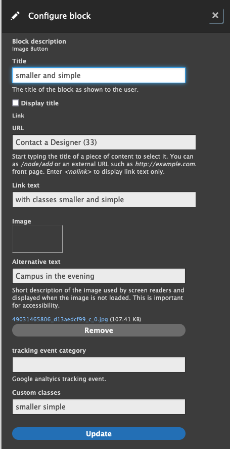
In many cases, you can also add multiple custom classes. For example, in image links, one of the variations has both smaller and simple added to the block.
This is done by typing out the first class name, adding a space and then typing out the next class name. You can try combining any variation you wish for each block type.
Accordion
The following is an accordion block. Ideal for FAQs, or content that should be hidden unless a user may have a specific interest in the hidden content.
Accessibility note: the headings can be adjusted in the block, but all headings in the accordion should be at the same level for best user experience.
This is the content related to the first question.
This is the content related to the second question.
Here's content related to a third question.
Announcement
This is an announcement. The icon can be changed by using the text for any Material Icon text. (For example, put "shopping_cart" in the field to use the Shopping Cart icon.)
Basic Block
Basic blocks are handy when all you need to do is put in some vanilla content. There are no customization options for basic blocks.
Beyond Basics Block
Beyond basics blocks have a number of options for customizing the headings, font, and background colors. There is also a custom class field for advanced styling options.
This block has a dark blue background, a sans-serif H2 heading, and large font.
There are some spacing and alignment classes that can be added to the "Custom classes" field of a beyond basic block as well.
Margins
Margin classes add space around the outside of the block.
Class: standard-margin
Adds 12px of margin all around the outside of the block. You can also specify standard margin on certain sides:
- standard-margin--right
- standard-margin--left
- standard-margin--top
- standard-margin--bottom
Class: double-margin
Adds 24px of space all around the outside of the block. You can also specify double margin on certain sides:
- double-margin--right
- double-margin--left
- double-margin--top
- double-margin--bottom
Class: no-margin
Removes the margin space around the block. You can also specify no margin on certain sides:
- no-margin--right
- no-margin--left
- no-margin--top
- no-margin--bottom
Padding
Padding classes add more space within the block, around the content.
Class: standard-padding
This block has 12px of padding. You can also specify standard padding on certain sides:
- standard-padding--right
- standard-padding--left
- standard-padding--top
- standard-padding--bottom
Class: double-padding
This block has 24px of padding. You can also specify double padding on certain sides:
- double-padding--right
- double-padding--left
- double-padding--top
- double-padding--bottom
Class: no-padding
This block has its padding removed. You can also remove padding on different sides of the block:
- no-padding--top
- no-padding--bottom
- no-padding--right
- no-padding--left
Text Alignment
Text within a block can be aligned in certain directions.
Call to Action Links
There are a number of custom classes that can be added to these blocks to change the size, color, and shape of the links. The bolded text above each button is the class that can be added to the "Custom classes" field in Drupal.
The icon field can be updated with any Material Icon text. (For example, put "shopping_cart" in the field to use the Shopping Cart icon.)
Additionally, Google analytics tracking events can be added to CTA links via Layout Builder.
Cards
Larger clickable areas that can contain images, brief description, and related terms. Cards do a good job highlighting staff profiles, upcoming events or stories.
Default Card Style

This is a basic card with an image, some text, and some highlighted terms
Color Block Title

This car contains the class "color-block-title"
The title color can be changed with the classes "dark-blue" or "light-green" as well
Content Switcher
Item one content
Item two content
Item three content
Countdown
Displays time left before an event or other timed content.
Donut Chart
These charts are donuts by default, which are easier to read. However, you can transform your donut into a pie by adding "pie" to the custom classes field.
You can also change the color of your chart by adding either "light-blue" or "green" to the custom classes field.
- 44% Thing 1
- 12% Thing 2
- 15% Thing 3
- 3% Thing 4
- 2% Thing 5
- 2% Thing 6
- 16% Thing 7
- 6% Thing 8
- 44% Another thing 1
- 12% Another thing 2
- 15% Another thing 3
- 6% Another thing 4
- 3% Another thing 5
- 2% Another thing 6
- 2% Another thing 7
- 16% Another thing 8
Headline
Headlines aren't really intended for use in Layout Builder. They're intended to be used in the splash area, and have to be configured via a site-wide configuration.
However, they still appear in the list, so this is what they look like.
There are several styles of headlines available.
Image/Video
An image will stretch to fit it's containing section.
Note: You do not have to use an image block to get an image on a page. You can also embed images in basic and beyond basics blocks!


Image with Description
This block works really well when showcasing a collection of different items. It has options for changing the block color, as well as for flipping the block so that the picture appears on the opposite side.
Image Links
Image links work well alone or in groups. They work really well when placed in a Flex Container layout, as they'll space out evenly.
If you don't want the extra styles and animations on your buttons, add "simple" to the custom class field.
Page Menu
This block provides a navigation list of links, either as anchors or to other pages. See How to Create an Anchor Link for linking to in-page content.
The block works best when placed before the main page content. This could be in the first section of content, and in the first column of a multi-column section. This ensures on mobile the navigation block shows up first before the page content, and not below it.
Quote
This is a simple quote block
Name of person being quoted
Something about that person
Schedule
1:00 PM Opening Ceremony
Join us for the opening statements of our guest speaker. Tea and cookies will be available.
1:30 PM - 4:00 PM Breakout Rooms
Meet with some new people and go over some wild new ideas (this section is linked)
4:00 PM Closing Ceremony
Statistics Collection
The icon field can be updated with any Material Icon text. (For example, put "shopping_cart" in the field to use the Shopping Cart icon.)
Side by side
30%
More Stars
22
Hearts Added
1
Moon left
Stacked
2634
Pancakes served
763
Gallons of Syrup
3622
Globs of butter

Testimonial
This is a basic testimonial
Name of person
Something about them
name of personsomething about them
White Space
The white space block doesn't display anything, it just helps with adding vertical white space to desktop layouts. These blocks collapse on smaller screen sizes.
You have to add a title, but you should uncheck the "Display title" option on these blocks.
